TPG Usage Widget for OS X
Update: Make sure you get the latest version of the widget!
Since I’ve hit my bandwidth limit with TPG this month, I figured a Mac OS X dashboard widget would be a good way of keeping tabs on my usage in future. The only one already available didn’t work for me, so I made my own.
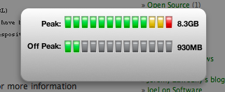

It’s pretty simple it shows your choice peak usage, offpeak, both or both combined and you can set your bandwidth limits.
Download TPG Usage Widget (version 1.2, 88kb zip)
I’m not sure how frequently TPG update their Your Account area with bandwidth information, but this is where the widget gets the data from.
Resources I found useful for this:
- Dashcode – the first time I’ve used an IDE. It wasn’t bad once I stopped typing vim commands, but there’s still a little bit of “magic” that’s hidden from you
- Mostly existing widgets. It’s all just JavaScript, HTML, CSS under the hood. Right-click any widget and do “Show Package Contents”
- A very introductory tutorial
- The Flip Side – Some useful tutorials, just search
The biggest gotcha for this app was allowing network access (under Widget Attributes in dashcode, or in Info.plist). It turns out if you make an XMLHttpRequest with this disabled, the request doesn’t happen (obviously), but no error is thrown and you just get an empty string for responseText
Update 1/06/08: Updated the widget to fix some very minor bugs, and adding usage expiry date information, as requested by a few people.
Update 22/06/08: Update to improve the indicator values and fixed minor expiry days countdown bug
Update 27/07/08: Update 1.4 to fix a major bug
May 22nd, 2008 at 8:15 am
Love the widget but what would be super cool is some idea on how many days you have left.
Cheers
Gerard
May 27th, 2008 at 9:33 am
Great widget… Would also be nice if it showed what usage should be at that date if you used the max daily average (ie: number of days since starting new billing period * Download Cap/month days). On 40gb peak that’s about 1.3gb/day
I have a little table drawn on a post-it note that I can refer to but if another band went behind it would be great. Then you could tell if you are ahead of your average and take it easy to prevent disappointment later in the month.
Not the best written explanation above, but its late here…
Thanks!
May 31st, 2008 at 10:16 pm
Thanks for the feedback guys. I’ve added the expiry date to the front of the widget so that it will display the expiry date, or number of days left (if under a week)
Steven, I’ll look at your suggestion soon… sounds like an interesting idea
June 26th, 2008 at 8:28 am
Hi, just signed up with TPG after being with Netspace for years. The widget I had there was comprehensive, and you’ve done a good job. The other TPG widget didn’t work for me either.
I agree with the other guys – a little bar showing the progress of time through the billing period on the same scale as our usage will give us an idea of if we’re ahead or behind our download limit. The resolution might need to be a bit finer than the 13 indicators you show now – perhaps 31 divisions would be logical. That might require smaller indicators, although I wouldn’t care if the widget was three times wider (I don’t have that much on my Dashboard).
Great job so far.
June 26th, 2008 at 8:43 am
Any thoughts on the current approach I’ve taken, with setting the thresholds for the yellow and red sections of the bar based on where you *should* be (assuming you’re aiming for 100% usage 😉 )
June 27th, 2008 at 8:32 am
I reckon everyone knows their target, and the progress bar “lights” are a good enough warning that you’re approaching the end. Might I suggest that you change the colour of all the lights depending on if you’re behind, ahead or REALLY ahead of your pro-rata usage?
For example, if you’re 6 days into a 30 day month (20% of the way through the period) and you’ve used less than 20% of your limit, then the lights are green. If you’ve used 20% of your downloads, or are up to 10% over of your limit then the lights go yellow, and if you’re more than 10% over your limit then the lights go red.
What do you think?
June 27th, 2008 at 8:43 am
Sorry, now I understand what you’ve done. I just saw your other blog trail (?p=21, we’re on ?p=14) and saw that you have made these changes already (although you’ve gone for within-a-day-from-going-over being yellow rather than once you are over). Oops. Still, I wouldn’t mind a bit more detail in the graph (more lights) and a corresponding bar graph showing time progress through the billing period.
July 12th, 2008 at 10:20 am
Hey great job on the widget, I was sick of logging into the crappy TPG site to check my account usage. Much better with this widget, simple presentation of the info, I can tell at a glance what my usage it.
June 18th, 2009 at 6:57 am
[…] TPG: If you’re brave enough to go with TPG, you can find widgets here and here […]
February 11th, 2011 at 5:33 pm
Is this still active?
I have been searching around for a widget to do exactly this but it doesn’t work with the new TPG plans. If this widget is not inactive please disregard this.